When it comes time to pick a new paint color for your home, do you find yourself up to your ears in paint samples not knowing what direction to go? Do you find yourself admiring design ideas online and trying to figure out how you are going to accomplish that look; but inevitably conclude that it is too overwhelming so you will just paint everything a nice cream color? That is the same for most people, because there are so many colors, hues, tints, tones, and names that the whole process becomes so overwhelming and seem like a hopeless endeavor.
It doesn’t have to be!
Even though color and paint is my FAVORITE was to spruce up a room, and something that I love selecting; I myself get overwhelmed sometimes when the colors just aren’t working with me.
For those of you who want to take the first step to color, here are 8 full proof color schemes to help you get started:
1. Yellow and Blue: As primary colors, they share an uncomplicated, elementary quality that keeps them in sync.
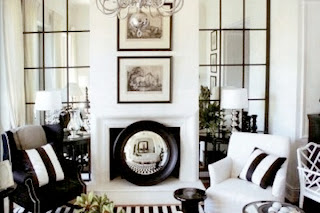
2. Black and White: No Brainer, right?! It's dramatic, sophisticated and as classic as you can get. In any room, in any amount, it's absolutely fail-safe, and you can mix in dabs of whatever accent color appeals to you.
3. Pink and Green: Think about nature: pink flowers atop green stems, blooming from shrubbery, surrounded by foliage.
4. Navy and White: A starched white button-down topped with a navy blazer never goes out of style, and neither does a navy and white room.
5. Yellow and Gray: Yellow helps somber gray to lighten up; gray calms yellow down and keeps it from bubbling over. It's a win-win.
6. Red and Beige: Temper the bold of red with a swath of beige to create a rich, inviting, but still mellow space.
7. Blue and Orange: They're opposites on the color wheel, and paradoxically that means they go well together. I usually opt for more of a turquoise and coral color, to tone down the hue and make it more appealing and not so harsh.
(Go Broncos!)
8. Lavender and Brown: The key is to keep the lavender from getting too bright — a chalky pastel shade works best and looks luminous against deep brown.
You can do it! Grab a bucket, or two, of paint and get started!
c2
STAY CONNECTED:


No comments:
Post a Comment