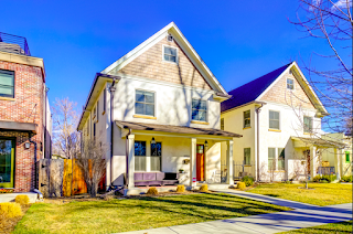
Fresh, modern, and collective; this Platte Park home brings personality throughout its design. Located just two blocks from Pearl Street,
it is the ideal location for top restaurants and shops with a small community
feel.
In 2013, the homeowner was living in a Denver Country Club condo,
needing some help with her condo’s overall design aesthetic. She reached out
to designer Corinne Ekle for just a little help in one room. One room turned
into the whole condo! She upgraded her style to be functional yet modern.
Shortly after the design project was barely lived in, the homeowner decided to
move into her current Platte Park home.
To see how the condo’s style translated, follow this link
back to the 2013 blog post!
The homeowner wanted to continue the look of her newfound
style in her new home. Since much of the furniture was replaced during
the first design round, it transitioned beautifully into the new space. Though
many major accessories and furniture were taken care of, additional furnishings
needed to be added to fill home.
Throughout the home, a new paint palette was selected for the
interior. The taupes, grays and whites complement the new furniture and
fixtures on every level. Nothing shows how important it is to tie rooms
together with color then it does in their open space concept. The kitchen,
dining room, and living room can be seen all at once. The same colors are used in different ways to make each space separate while maintaining cohesiveness.
The kitchen was outfitted with new glass, globe pendants.
The wonderful thing about these glass light fixtures is that it gives off the
most amount of light while maintaining its design essence. Acrylic bar stools
rest under the kitchen island while modern silver and white accessories sit on
top. These accessories tie in the silver metals from the pendants, to the bar
stools, down to the appliances.
In this open space plan, the dining room opens up into the
living room. Large windows provide natural light to the space. Taupe and gray
with splashes of orange make this room fun and inviting. A silver accent table
and a glass coffee table with silver legs beautifully speak the language of the
kitchen accents.
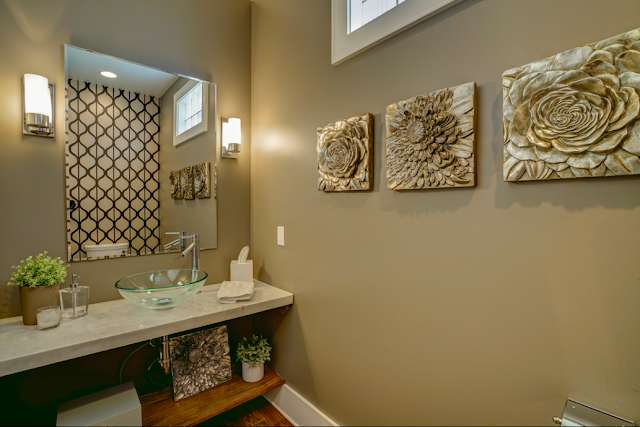
Just off of the kitchen and dining area there is a fun powder room that the homeowner wanted to add some personality to. Ekle did this by putting bold, geometric, black and brushed gold wallpaper on the back wall which give the small space depth and visual interest.
Just off of the kitchen and dining area there is a fun powder room that the homeowner wanted to add some personality to. Ekle did this by putting bold, geometric, black and brushed gold wallpaper on the back wall which give the small space depth and visual interest.
The splashes of orange that begin in the living room are
carried into the office and guest room. The home office
boasts modern
patterns seen in the area rug and stool. A high gloss white desk keeps the
room light.
The guest room also shares the same white and orange palette. Any guest would feel right at home in such a serene environment!
Serenity is an important vibe to have in any bedroom. The master bedroom is designed in neutral colors. The upholstered headboard creates a backdrop for a variety of fun,
textured pillows. On either side of the bed, two oversized lamps ground
the bedroom. Above the bed, a free form metal art piece brings that modern appeal
to the overall design.
Ekle loves to set women up with what she refers to as a "battle zone". A battle zone is a desk that solely serves the purpose of getting
ready in the morning with hair and make-up. This master bedroom had enough space to add one and was a must with all the natural light!
Outside of the bedroom, an overly large landing area needed
some attention. A sitting room was the perfect fit. Two chairs are positioned conversationally and new
lighting keeps the room well lit for such occasions.
Just when you thought you couldn’t feel more at home and
relaxed in this house, there are two rooms that we could not go without mentioning in the loft area of the home....talk about maximizing the floor plan. How about spending some time in the craft room or yoga room?! Yes, an afternoon of crafting can immediately be followed with a moment of Zen under the same roof.
Since these two areas are traditionally not in a home, these
rooms can have their own rules when it comes to design. Though it is important
to keep the overall style in line with the house, it has more liberty to carry
a fun twist. In the craft room, the geometric shape of the home's roofline accentuates a bright green accent wall. A mid mod sofa is the perfect place to
hang out while your wild craft ideas start to form. The glass table across from
a bronze console makes this room not only fun, but modern.
The yoga
room brings down the visual stimulation to a calm feeling. Working with the
same geometric lines of the room, a soft taupe makes them not as noticeable.
The newest workouts from magazine clippings are hung along the wall for easy access. These
two spaces certainly complete the overall package of the home.
This project truly
shows how a home can show the personality of a homeowner while keeping a
cohesive flow of style throughout.
For pictures of the whole finished project, visit our HOUZZ page:http://www.houzz.com/projects/1626937/platte-park-contemporary-home
c2
For pictures of the whole finished project, visit our HOUZZ page:http://www.houzz.com/projects/1626937/platte-park-contemporary-home
c2
STAY CONNECTED!!


No comments:
Post a Comment