Kitchen remodels can be a huge undertaking. What about a kitchen, bar and laundry room remodel?! Well that’s exactly the journey we embarked on with a Colorado family at the end of 2015. The final touches were completed this past week and we couldn't be happier! Here is how it all came to be.
This family of 4 decided it was time to make their beautiful
Tudor style home represent their modern lifestyle today. A poor kitchen layout
destroyed the natural flow of their living space. Not only did the kitchen
physically have tight spaces, with dropped ceilings and a closed off bar area,
but visually gave off a less then desirable impression. It is amazing what bad
lighting, short cabinets, and out of date finishes can do to a home! Oh, and did we mention there was a huge copper hood in the middle of the ceiling?! Yes, there was a lot going on and not much of it was good.
Our clients wanted to create a space that allowed easy movement
from the kitchen, to the bar, to the family room. A love of entertaining
inspired the family to rethink the central hang-out spots.
Traditionally, Tudor style homes were designed to host guests in other living
areas; a more modern approach to entertaining today is in and around the kitchen.
That is exactly what they decided to do; make the kitchen the heart of the home. It was important
to modernize the features while keeping true to the characteristics of the homes style. Not only did they hope to gain more storage throughout, but
wanted to utilize the laundry room as a drop off point for storage overflow and
everyday items.
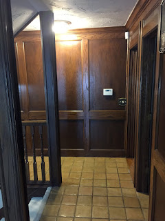
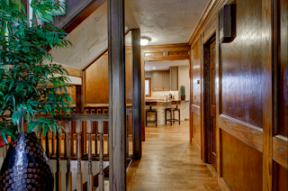
First order of business; open up the entry to the kitchen! We did this by extending the opening into the kitchen from the foyer to a large
5 feet. This was a challenge. The original paneling, molding and trim had to be
replaced to make it appear as if it had never been touched. Fortunately, the
experts at Jaguar Construction undertook this challenge along with the
whole remodel from start to finish.
The construction phase of the remodel generally takes up
half the time of the total process. In this case, a full wall, upholstered walls and saloon doors that once closed off the bar area, needed to be removed. A new header
beam was installed between the kitchen and living room to lend support to
the new open area. Once these structural items were taken care of, wide 4” oak
floors were laid in the whole space. Working from the studs does come with many
advantages. We were able to re-work plumbing and electrical without walls
interfering. Our client was able to get all new lighting to brighten every spot
of their kitchen and new plumbing to work in their favor.
Now onto the second phase of the process (a.k.a. the fun part!) We created a modern space by using 2 color
tones for the cabinets. A lighter color was chosen for the uppers and a contrasting
dark tone for the base. To incorporate the two colors into the overall space, we choose
the lighter putty color for the hutch and the darker color for the bar area.
Travertine, beveled subway tile was laid in a herringbone basket weave. This
layout was designed to emulate the pattern in the existing brick fireplace located in the living room.
The homeowners chose top of the line stainless steel
appliances to compliment the design details. A single steel granite sink
was selected in a cappuccino color. It blends beautifully with the countertops.
We added more depth and interest to the bar by selecting a stacked stone for the
front sides of the counter. This visually connects the kitchen's backsplash to
the bar area allowing continuous flow throughout the space.
We couldn’t discuss the bar and kitchen without mentioning
our clients fabulous laundry room! Just like the other space, we redesigned
the layout be more functional. The laundry room door was moved to the hallway by the bar in order
to open up space for their new hutch (located on opposite side of wall). Modern 12” x 24” tile was laid on the floor, while granite countertops and a stainless steel sink now grace the new cabinets. A mud bench with hooks (not pictured) finished off
the newly designed laundry room.
The time we spent with both our client and Jaguar Construction was such a pleasurable experience. Thank you for allowing us to take on such a huge remodel! We couldn't start off 2016 any better!
For pictures of the whole finished project, visit our HOUZZ page:
http://www.houzz.com/projects/1542516/tutor-home-kitchen-bar-and-laundry
For pictures of the whole finished project, visit our HOUZZ page:
http://www.houzz.com/projects/1542516/tutor-home-kitchen-bar-and-laundry
STAY CONNECTED!!


No comments:
Post a Comment