Saturday, September 12, 2015

Kitchen Remodel in Denver Complete!


 You don’t truly understand the phrase,  'kitchen remodel’ until you have actually gone through your own kitchen remodel. A full kitchen remodel is far more complicated then pulling down the old cabinets and putting in new ones. It is a process that requires patience, flexibility, and many team members to pull off such a beautiful finished product! Our clients the Grossman's willingness to go on the kitchen remodel ride gave them a kitchen to be proud of! 

When we first met with the Grossmans, they expressed their dislike for the function of their kitchen. Lack of cabinet space and lack of a easy traffic flow caused them a headache every time they entertained or cooked. Then and there it was decided that something needed to change.
No prep space next to the stove, low overhead cabinets, and a large intrusive peninsula

 HUGE commercial fridge next to the oven which made it very hard to navigate the kitchen

Bar the extended between the kitchen and the living room. You had to go all the way around to navigate both spaces...this needed to change for traffic flow!

Down to the wall studs it was! 

Opening between the two rooms where the bar once was

Gutted Kitchen and higher ceiling height

The Grossmans kitchen involved some structural adjustments such as removing the ceiling soffit to add ceiling height. Plumbing and electrical had to be relocated but it was worth it to accommodate the new new tall 42" upper cabinets.

All of the time using a makeshift kitchen and the headache of living with construction dust paid off because now they get to enjoy this gorgeous space!

Re-working the overall traffic flow of the kitchen relied heavily on changing the layout. What was once a peninsula countertop is now an open pathway with a skinny island in the center of the space. Now company and kids can gather around the whole area instead of one side and be in the way of the action. The largest change that has transformed the area is the removal of a wet bar the stood between the living room and the kitchen. It just created an awkward area that was more wasted space. We completely demoed the wet bar as well as the hallway closet behind in the hallway. It was important to have a bar in some capacity, but one that was conveniently tucked away. We ended up placing a mini bar that the space the hallway closet once occupied. It is the perfect space for storing bar accessories and have a second sink in the area.


Now that the layout was greatly improved, it was time to see that whole kitchen come together through the selected finishes and appliances!

The gorgeous light cherry Fina cabinets purchased through "Kitchens At TheDenver" compliment the   organic swirls of beiges, purples, and gold sparkles Cambria quartz countertop beautifully. The a light beige mosaic travertine backsplash was added to give depth and brighten up the whole space. New refrigerator was moved over from its original location to make it more accessible. They traded in their gas stovetop and hood for an induction cook top with a new stainless steel microwave above to maximize space win their kitchen and allow for more cabinet and counter top space.


Some of the added features that brought the kitchen from standard to customized were the soft close doors on the kitchen cabinets, Kohler faucets, under cabinet lighting, can lighting as well as CAI pendantlighting in an oil bronzed finish. A new Blanco steel granite composite sink was placed in the same location. 


The Grossmans can now proudly say that they have survived a full kitchen remodel. It was a pleasure working with such a wonderful family. We are so excited to hear how their first party goes!  

c2

Always stay connected and up to date with all that we are doing.
STAY CONNECTED!!

Wednesday, August 26, 2015

New Pergola on Cherry Street


Summer may be slowing down, but that doesn’t mean that your patio will be seeing any less of you. We recently did a complete remodel on a backyard patio that will now be seeing some good company for many years to come!


We first worked with the homeowner when we re-did their basement bathroom. Once that was completed, they were ready to start a new project. They had recently moved into their home and discovered that the back pergola was a weekend project probably done by the previous owners. Though it looked okay, there were many structural problems. It was best to scrape the whole back yard patio and pergola, and start from the beginning!

During the Demo

We designed the pergola to work with the house. It was important to concentrate the structure just over the back yard patio because before it ran to the garage. This allows the space to look and feel more open.

Since the new pergola was looking so good, we thought it would be worthwhile to re-concrete the whole drive way as well as well as the walkways. To give the main patio and walkways a special look, we used Custom Stone Resurfacing, a type of epoxy stone.


We are so happy this beautiful couple can now enjoy their new patio for the rest of the season! And in the process, we learned they are expecting their first baby! Congratulations! We are so exited for you and your growing family!


c2

Always stay connected and up to date with all that we are doing.
STAY CONNECTED!!

Friday, July 31, 2015

Accent Walls: How To

Have you ever decorated a room in your home and felt something was missing? Pictures are hung, your throw pillows are matching splendidly and your rug and couch are perfect together… but still something is missing. May I suggest an accent wall? I know what you're thinking, ‘accent walls were so last year’. But that’s not true! Accent walls are still alive and making stunning appearances in rooms around the US. Here are some bulleted guidelines on how to choose a color and where to place it.
  • Pick a wall that your eye automatically gravitates towards. When you walk into the room absent minded, where is the first wall you eye goes towards? That’s your focal point.
  • OR… pick a wall that needs a little TLC. Do you have a side mini area that feels neglected? Choose a bright version of your accent color and paint it only on that wall. Add a ultra modern picture gallery and now the neglected wall shines like all the others.
  • Why not the ceiling be your accent wall? Dark colors make the room feel cozy and more intimate. Great for tall ceilings or a dining room.
  • Color choices? The general rule is to go two shades darker then your overall color. Look at the color strip with you overall color and go up two shades.
  • OR… Choose a super fun contrast color that will bring out your accents in the room!
Here are some of our projects where we have incorporated accents walls.


Need more inspiration? Just type in accent wall in your search engine and it will give you countless ideas!

Have a great time painting your walls! Send us pictures of your accent wall and be featured in our next article! Or, if you are in need of our services, we would LOVE to come see your home! 
Always stay connected and up to date with all that we are doing.
STAY CONNECTED!!

Wednesday, July 15, 2015

Before and After... A Home Gets a Face Lift


We love a good before and after picture, especially when it involves a home that just needed a little TLC. Located in Centennial, Colorado, this house got a total head to toe make over before it was put up on the market. We were brought into this flip when it was already in progress. This home felt like a throwback to the 1970’s and was in desperate need to be brought into 2015!

Bathrooms were completely gutted and redesigned. A free standing shower with a decorative tiled border keeps the space open while offering some privacy. 


The fireplace was resurfaced in a stacked stone that contains beautiful beiges of all tones. From floor to ceiling, this focal point is a great visual that can be seen from almost every angle on the main floor.


The kitchen was completely reconfigured to be more user friendly. We had the chance to pick out a gorgeous travertine floor tile, another bold stacked stone for the backsplash to compliment the refreshed tones in the whole house.


The exterior paint color is always the most fun. The tired brown siding and dated stone work was removed because it was not helping this home in any way aesthetically  We stuccoed around the front entry for a clean look, added a beautiful half moon window for more natural light, and switched up the color to a warm gray that gave an instant facelift! Adding the red door makes everyone feel welcomed and can be easily spotted from the street.


We can’t wait to continue working with this team. They really are changing Denver one house at a time and we are honored to be apart of it.

c2


We love to be social! Get the latest updates on what c2Design is designing! 

STAY CONNECTED!!

Tuesday, June 9, 2015

The Coolest House in the Neighborhood


Growing up, the minds of kids often dream of having their house be considered a ‘cool house’. Meet the family that now has the coolest playroom and bedroom in the neighborhood! We transformed an ordinary playroom into a playroom that reflects the style of today. On top of that, a teenager’s bedroom gets a complete makeover, bed and all.
BEFORE:

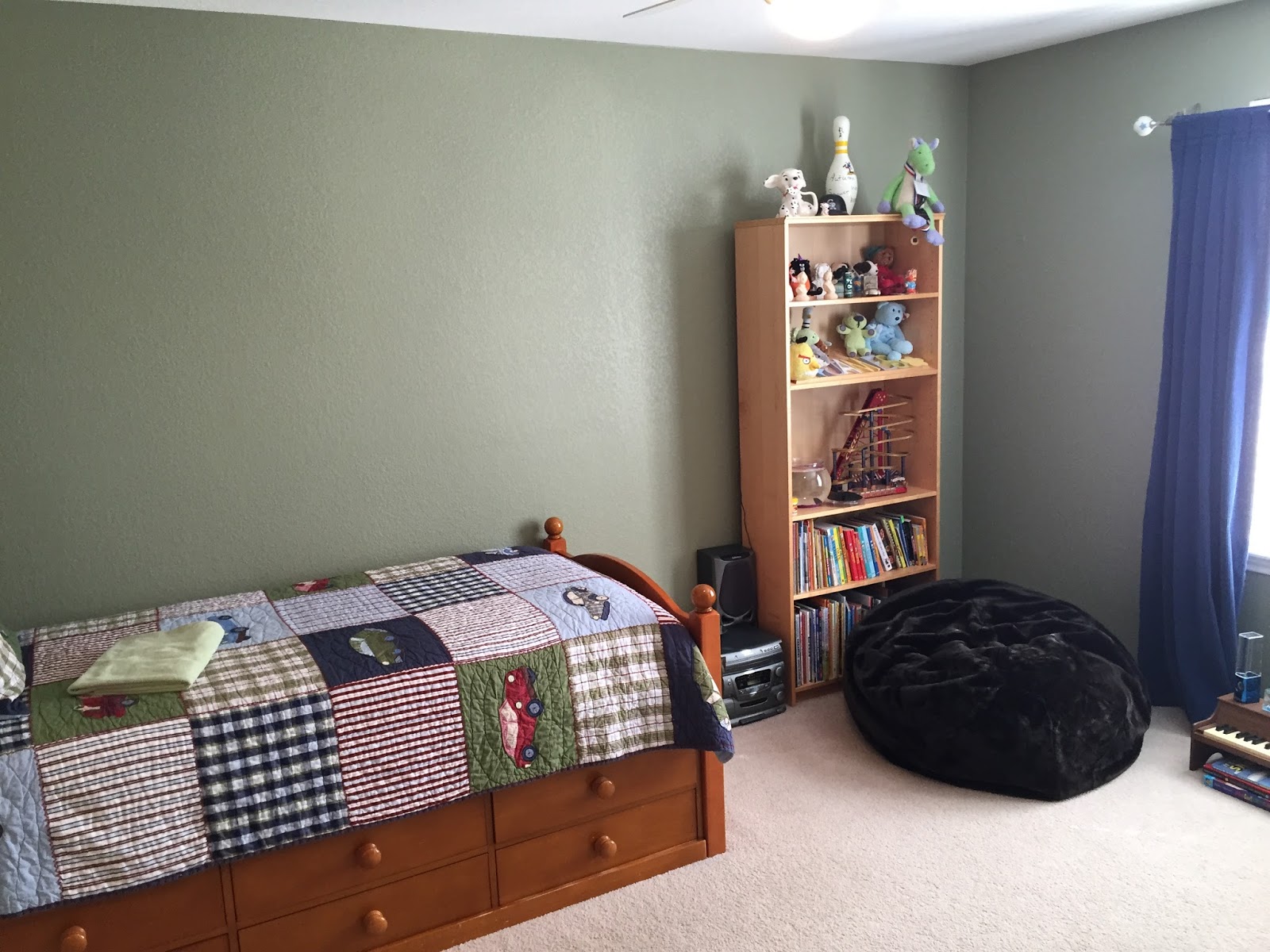
First lets begin in the playroom. Before, the parents did a great job painting the walls bright colors and adding some bookshelves for storage. Despite their efforts to keep the kids things tidy, the accumulation of toys just became overwhelming and left little place to keep them. It was important to create accessible storage in the space without looking like… well storage.  

We first eliminated the wall colors and created a neutral color palette expect for one wall which we painted in black chalkboard paint! Keeping the color neutral, we are able to have fun with our furniture and accessories in the room. Cubed storage bins line the full wall. The cubes contain colorful crates that allow the kids to store toys and school supplies. 


A brightly colored rug sits beneath a white lacquered craft table. Four funky red chairs allow both kids and adults to spread out their creative projects and have plenty space to spread out. The kiddos did most of the accessorizing with their awesome artwork, figures and collectables. We finished off the space with a black, whimsical wire lamp, red clock to keep time, and a white board. Let the play begin! 

But first, we have to tell you about James’ awesome room.
BEFORE:
Sharing a Jack and Jill bathroom with the playroom is James’ room. Loving the colors yellow and orange, we wanted to give him a colorful room that reflects his teenage status. We were inspired by the bold colors and stripes we found in a bedspread. 
Keeping with that theme, we painted bold horizontal lines in blue, yellow, and orange. Rustic metal letters spells out his name above his bed to let everyone know whose room they are walking into. 
A dark wood bed frame with a matching nightstand gives the room a sturdy, timeless feel. For the second nightstand it was a locker inspired table, (metal locks and all) which really transformed this into a boys room. Two yellow lamps on either nightstand tie together the wall and bedding. 

James finished off the space with his oversized beanbag chair so that he could have a comfy corner to do all his reading.


Thank you for letting us create such a fun project! We really enjoyed letting our inner child out. Hope you have some amazing  creative sessions in your new space!

Wednesday, June 3, 2015

Denver Life Magazine Show House 2015


It has been an honor to be involved in this years Denver Life Magazine Show House. We are excited to share the finished product with all of you!

In case you didn’t hear, Corinne Ekle, owner of c2Design, was selected as one of the designers for this years show house put on by Denver Life Magazine. Her challenge was to transform the basement bed and bath into a luxurious retreat. 

In the bedroom, she took a risk by placing a band of wallpaper from the wall up to the dark high gloss ceiling. She knew people would either love it or hate it, but either way she wanted to evoke some kind of emotion. Turns out people loved it!

The wallpaper sets the stage for the room. It was important to keep the other colors neutral. A dark walnut wood bed frame from Lexington Home Brands suggests a modern luxury hotel feel with the slight curve in the frame. Custom drapery in a heavy dark beige fabric are hung as close to the ceiling as possible to dramatize the high ceilings. A white lacquered console provides a place for guests to set their things for their stay. Gold and silver accessories decorate the tabletops to cap off the clean lines.


In the adjoining bathroom, Candice Olsen wallpaper was used to create a bold statement. It ties in beautifully with the bedroom. We couldn’t be prouder of Corinne Ekle on all her accomplishments! Her room turned out to be beautiful and we can’t wait to see what else she has up her sleeve. 

Thank you to Denver Life Magazine for hosting such a wonderful project for a wonderful cause, Habitat for Humanity. You can find the house featured in a 26 page new spread in Denver Life Magazine now in stores.

Don't forget to stop by the showhouse and see for yourself! Is now open to the public 9:30am-3:30pm at 1535 S Clayton St., Denver, 80210.

Lacey
c2